


Last year, I made what my family called a “radical” decision – I ditched the traditional red and green Christmas scheme for something completely different. I’ll be honest, my mother-in-law raised an eyebrow when she walked into my living room and saw blush pink ornaments mixed with deep navy accents. But by the end of the evening, she was asking where I’d found those gorgeous dusty rose garlands.
That’s the thing about pink Christmas decor – it catches people off guard in the best possible way. But here’s what I learned during my first pink Christmas: not all pinks are created equal, and the magic really happens when you understand how different shades work together and with other colors.
If you’re ready to explore the wonderful world of pink holiday decorating, let me walk you through the various shades of pink and how to combine them with other colors to create a Christmas aesthetic that’s both sophisticated and festive.
Understanding the Pink Spectrum: Your Holiday Color Foundation
Before we dive into combinations, let’s talk about the different personalities of pink. Each shade brings its own vibe to your holiday decor, and understanding these differences will help you create the exact mood you’re after.
Blush Pink: The Gentle Giant
Blush pink is your go-to for creating an elegant, understated holiday atmosphere. This soft, barely-there pink has just enough color to feel intentional without overwhelming a space. I think of blush as the diplomat of the pink family – it plays well with almost everything.
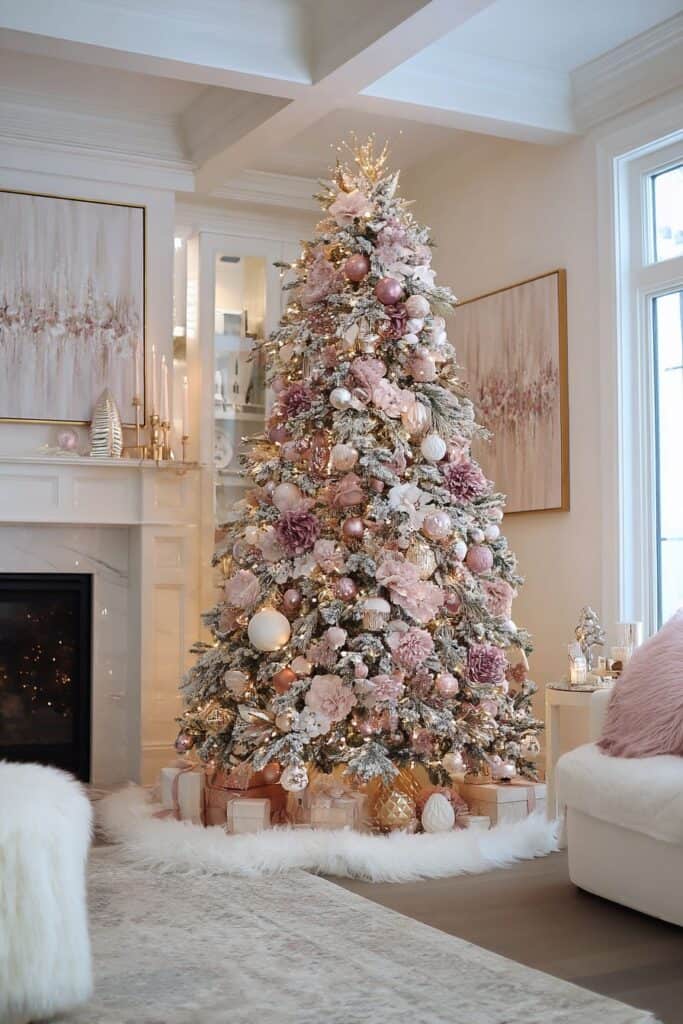
In holiday decor, blush pink works beautifully for ornaments, ribbon, and fabric elements. It’s particularly stunning on Christmas trees because it adds warmth without competing with the tree’s natural green. I’ve used blush pink velvet ribbons on wreaths, and they create this gorgeous, luxurious texture that catches light beautifully.
Hot Pink: The Bold Statement Maker
On the opposite end of the spectrum, hot pink brings energy and drama to your holiday decor. This vibrant shade isn’t for the faint of heart, but when used strategically, it creates incredibly striking displays.
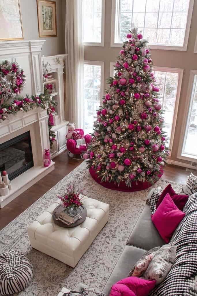
Hot pink works best as an accent color rather than the dominant shade. Think hot pink ornaments mixed with neutral tones, or hot pink flowers in arrangements that are primarily white and green. I once saw a holiday table where the host used hot pink napkins with white dishes and silver chargers – it was unexpected and absolutely gorgeous.
Rose Gold: The Warm Metallic Wonder
Rose gold sits in that perfect sweet spot between pink and metallic. It brings warmth to your decor while maintaining that luxurious metallic feel we all love during the holidays. Rose gold has become incredibly popular in recent years, and for good reason – it’s sophisticated and modern while still feeling festive.

Rose gold ornaments, picture frames, and candle holders can serve as either your main color or beautiful accent pieces. The metallic quality means rose gold reflects light beautifully, adding sparkle to your displays without being too flashy.
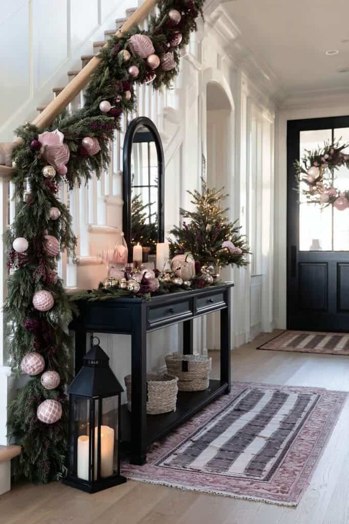
Dusty Rose: The Vintage Charmer
Dusty rose has this wonderful vintage quality that makes everything feel heirloom and timeless. It’s deeper than blush but not as bold as traditional pink, sitting in that perfect middle ground. This shade works particularly well in farmhouse or traditional decorating styles.

I’ve found dusty rose works beautifully in textile elements – think table runners, throw pillows, and garlands. It pairs wonderfully with natural elements like wood and greenery, creating displays that feel organic and collected over time.
Millennial Pink: The Contemporary Choice
This grayed-pink shade became hugely popular a few years ago, and it translates beautifully to holiday decor. Millennial pink is sophisticated and modern, perfect for contemporary homes or anyone who wants a more updated take on traditional Christmas colors.

Millennial pink works particularly well in minimalist holiday displays. Think sleek ornaments, simple garlands, and clean-lined decorative objects. It’s the perfect choice if you want pink Christmas decor that feels current and sophisticated.
Mastering Pink and Color Combinations
Now that we’ve covered the different pink personalities, let’s explore how to combine them with other colors to create cohesive, stunning holiday displays.
Pink and Gold: The Timeless Luxury Pairing
This combination never fails to impress. The warmth of gold complements pink beautifully, creating displays that feel both festive and elegant. This pairing works with any shade of pink, but I particularly love it with blush and dusty rose.

For your Christmas tree, try gold and pink glass ornaments in various sizes. Add gold ribbon woven through the branches and gold fairy lights for extra sparkle. On your mantle, gold candlesticks with pink candles create beautiful height variation, while gold picture frames with pink holiday cards add personal touches.
The key to nailing this combination is balance. If you’re using a lot of pink elements, let gold serve as accents through metallics like candlesticks, picture frames, and ornament caps. If you want more gold presence, use it in larger elements like garland ribbon or statement pieces, then let pink come through in flowers, ornaments, and smaller details.
Pink and Silver: The Cool, Contemporary Choice
Silver brings a cooler, more modern feel to pink combinations. This pairing works particularly well with millennial pink and blush tones. The contrast between warm pink and cool silver creates visual interest without being overwhelming.

Silver mercury glass votives filled with pink ornaments make stunning centerpieces. Pink flowers in silver vases create elegant arrangements, and silver picture frames with pink matting add sophisticated touches to mantle displays. On Christmas trees, silver and pink ornaments in different textures – think matte pink balls with shiny silver ones – create beautiful depth.
This combination is perfect for contemporary or minimalist holiday decorating. Keep lines clean and simple, letting the color combination be the star rather than overwhelming with too many decorative elements.
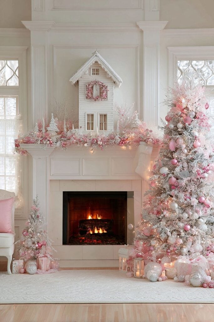
Pink and White: The Fresh, Clean Palette
Pink and white together create some of the most elegant holiday displays you’ll ever see. This combination feels fresh, clean, and incredibly sophisticated. It works beautifully with any shade of pink, though I’m particularly fond of it with blush and dusty rose.
White serves as a beautiful neutral backdrop that lets pink elements really shine. Think white table linens with pink runners, white candles in pink holders, or white ornaments mixed with pink ones on your tree. White flowers like roses or peonies mixed with pink varieties create stunning arrangements that feel both festive and romantic.

For table settings, white dishes with pink napkins and pink glassware create beautiful, cohesive looks. White charger plates with pink dinner plates add elegant layering, while white candles in pink holders provide gorgeous ambient lighting.
Pink and Green: The Natural Harmony
You might think pink and green sounds too much like a garden party, but when done thoughtfully, this combination creates some of the most beautiful and natural-feeling holiday displays. The key is choosing the right shades – sage green or eucalyptus green work beautifully with any pink, while traditional evergreen pairs best with deeper pinks like dusty rose.

Eucalyptus garlands with pink ribbon woven through create gorgeous natural displays. Pink flowers mixed with green foliage in arrangements feel organic and fresh. On Christmas trees, the natural green provides the perfect backdrop for pink ornaments of any shade.
This combination works particularly well for people who want pink Christmas decor that doesn’t feel too far removed from traditional holiday colors. The green grounds the pink, making it feel more familiar while still being unique.
Pink and Navy: The Unexpected Sophisticate
Now here’s a combination that really turns heads. Pink and navy might sound unusual for Christmas, but trust me – it’s absolutely stunning and incredibly sophisticated. This pairing works best with deeper pinks like dusty rose or millennial pink.

Navy blue serves as a rich, dramatic backdrop that makes pink elements pop beautifully. Think navy table runners with pink centerpieces, or navy ribbon mixed with pink on wreaths and garlands. Navy candles in pink holders create striking contrasts, while pink flowers in navy vases look unexpectedly elegant.
This combination is perfect for anyone who wants holiday decor that feels completely unique while still being undeniably festive. It’s sophisticated enough for formal entertaining but unexpected enough to be memorable.

Pink and Burgundy: The Rich, Dramatic Statement
For those who want pink Christmas decor with real depth and richness, pink and burgundy create incredibly dramatic and luxurious displays. This combination works best with deeper pink shades – think dusty rose or mauve tones.

Burgundy adds weight and richness to pink displays without overwhelming them. Burgundy velvet ribbons with pink ornaments create gorgeous texture combinations. Pink flowers mixed with burgundy ones in arrangements feel rich and sophisticated, while burgundy candles with pink holders add dramatic lighting.
This combination is perfect for traditional or formal decorating styles. It brings all the elegance of pink with the richness and depth of traditional holiday colors.

Creating Cohesive Multi-Pink Displays
One of the most beautiful ways to use pink in holiday decor is to combine multiple shades together. This creates incredible depth and interest while maintaining a cohesive color story.
The Tonal Approach
Using various shades of pink together – from blush to dusty rose to deeper mauve – creates stunning tonal displays. The key is to vary not just color intensity but also texture and finish. Mix matte and glossy ornaments, velvet and satin ribbons, fresh and silk flowers.
On Christmas trees, start with your lightest pink as the dominant color, then add medium and deeper pinks as accents. This creates beautiful gradient effects that feel intentional and sophisticated.
Balancing Warm and Cool Pinks
Some pinks lean warm (with yellow or orange undertones) while others lean cool (with blue or purple undertones). Mixing both creates visual interest, but do it thoughtfully. Use warm pinks as your dominant colors and cool pinks as accents, or vice versa, to maintain balance.
Texture and Finish Variation
When working with multiple pink shades, texture becomes incredibly important. Mix velvet, satin, matte, and glossy finishes to create depth. Different textures catch and reflect light differently, adding dimension to your displays even when working within the same color family.
Practical Tips for Pink Holiday Success
Start Small and Build
If you’re nervous about committing to pink Christmas decor, start with accent pieces and build from there. Pink ornaments on a traditional tree, pink candles on your mantle, or pink flowers in arrangements let you test the waters without major commitment.
Consider Your Existing Decor
Pink works with more existing color schemes than you might think. If your home has neutral walls and furniture, pink Christmas decor can work beautifully. Even homes with existing color schemes can often accommodate pink holiday touches.
Lighting Matters
The way you light your pink displays affects how they look dramatically. Warm white lights enhance the cozy, romantic feel of pink decor. Cool white lights create a more modern, sophisticated look. Avoid colored lights with pink decor – they can make colors look muddy or clash unexpect